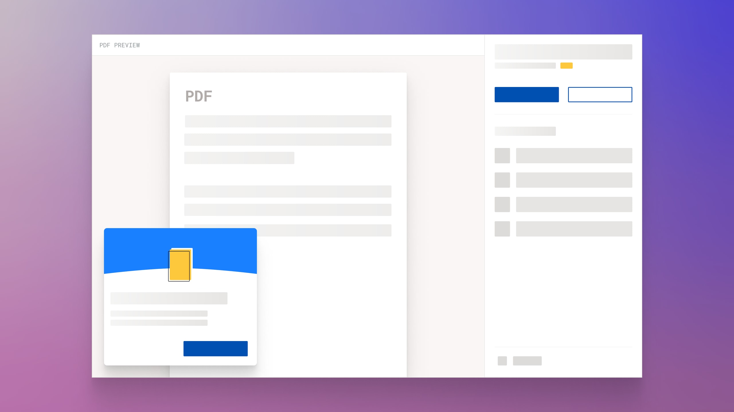
PDF Preview for Smallpdf

Legacy PDF Interfaces
While working at Smallpdf a task landed on my hands. The task was to redesign the interface people used to download their PDF files after a certain action, in order to increase the number of users who shared a file. There were other areas of interest as well. Increasing the number of free trials, tools usage and many more.
Until that point, when users completed an action with a PDF file, they faced a big rectangle area with a download link and a bunch of icons for further actions. On top and on the right of that rectangle area, ads appeared.
Attempts to improve the user experience and add value to the business always ended as different versions of the legacy interface.
The PDF Preview
I took upon the task with a different mindset. I started from scratch and did the research. After many iterations, the result was a simple yet radical new design. A design that, as far as I can tell, was the world’s first. A real-time preview of the PDF file with a clear hierarchy between content and file actions.
Content took up most of the screen. A sidebar on the right offered an unobstructed view of file related actions. Download, share, renaming, convert, edit and more.
The new design offered clear advantages compared to the outdated versions it replaced. For example, a user would compress a PDF file using difference compression options. With the new design, a user could:
- Immediately see a file preview and understand the previous action was complete and successful.
- Instantly assess the file quality before taking further action, like downloading.
- Act upon further actions with one click options based on their assessment.
- Experience incredibly fast interactions because of the local file rendering.
- Navigate through a familiar mental model.
The team ran a few tests, and the results were mind blowing. The number of people sharing files more than doubled. Revenue was up. NPS was extremely positive. Direct user feedback as well. Millions of users were digging it.
The Business Value
To add business value, I designed a new banner which prompted users to start a free trial. Once again, the approach was unique compared to the existing designs. The new banner had a playful and positive character reminiscent of video games. Subtle cues spoke to the user without words.
The new banner delivered outstanding results.

