Google Search AB Testing Designs for Cookies Consent on Mobile Devices
Google is famous for its data driven and AB test ethos. That’s not a bad thing and they are not alone in this kind of optimization and data driven approach. This kind of testing is very dear to them. They take the extra mile to test everything. Even if testing includes 41 shades of blue for web links. Just look back in 2009.
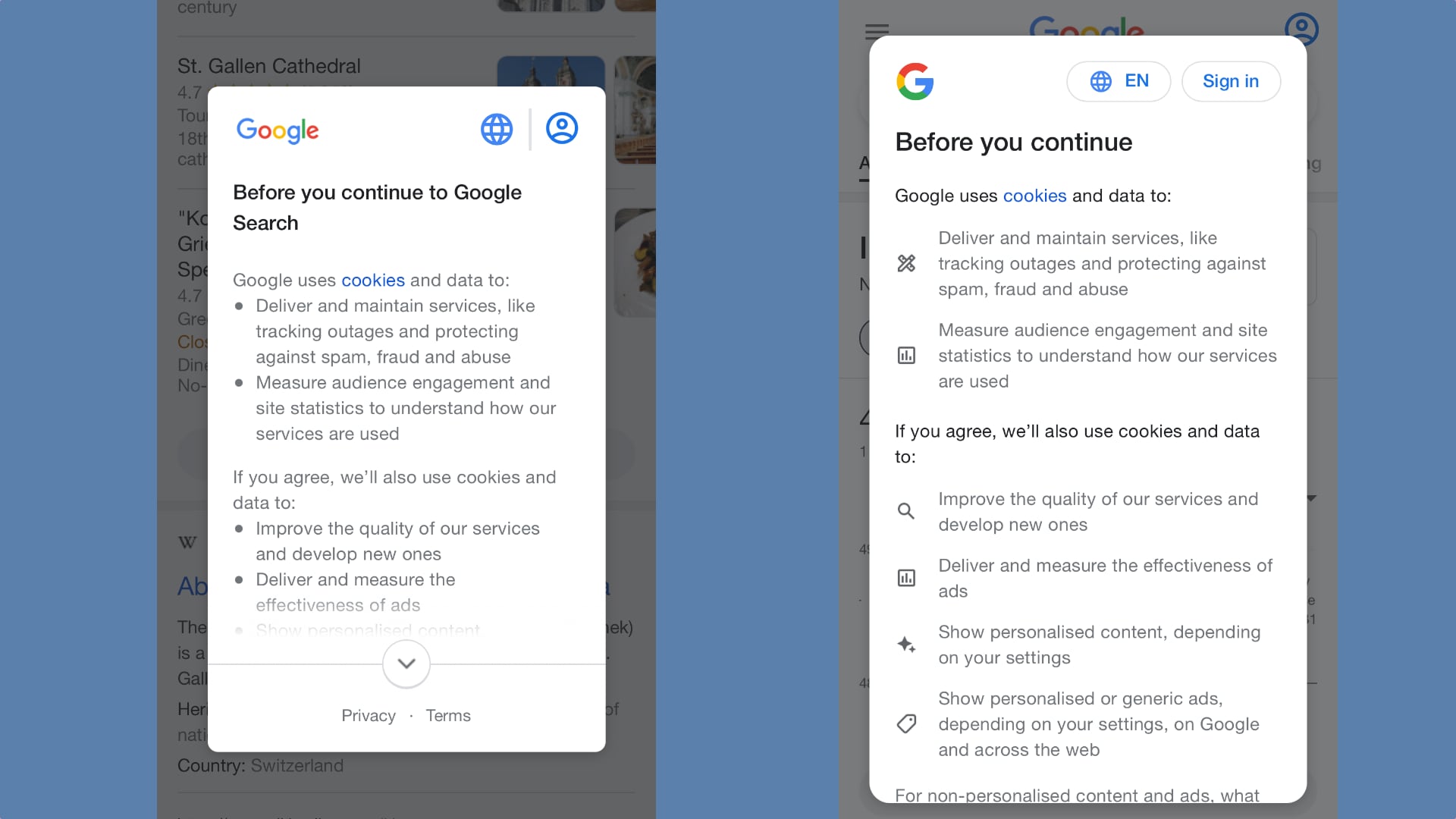
Google AB testing two designs for cookies consent isn’t big news itself. The subject of cookie UI is almost boring. What caught my eye is how different the two approaches are. The variance between them is so significant I wondered how they could tell why version A or B offers a better UI and UX for their metrics.
The first and obvious change is in size. The new design is bigger. It takes up more space on the screen. Logo is bigger. The heading fonts are bigger. Tap area for the language and Sign-in buttons is bigger. Google went away with the icons only design and added some copy too. In a plot twist, they replaced bullets points with a variety of small icons. There is more negative space too.
While adding a bunch of negative space, Google designers removed one thing. The tap to see more, button. This thing is out. No more hit and miss taps. No more accidental zoom-in on the page instead of seeing the next screen. The interaction is now scroll and swipe based. That’s a big shift.
As big as the introduction of icons instead of bullet points. I’m not sure why the icons have the alignment they do. Vertically centered to the copy. It makes little sense. This choice adds noise instead of clarity. Maybe that’s a CSS bug.
It’s hard to tell which version would perform better and understand why it did. There is an abundance of changes in the alternative design. I’m guessing design B will show better results mainly because of the new interaction model. Vertical scrolling on mobile devices feels more natural than tapping.