Oura Ring, Redesign UI & UX for Sleep with Framer X
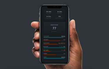
The Oura ring is a sleeping tracker inside a ring. Actually it’s a lot more than that but its sleeping tracking capabilities are amazing. The ring syncs all data through the Oura app and this is where the magic happens.
The app is good with lots of information. It works well and never crashes. There are some minor issues every now and then but that’s okay. The overall experience is solid. Solid but not great.
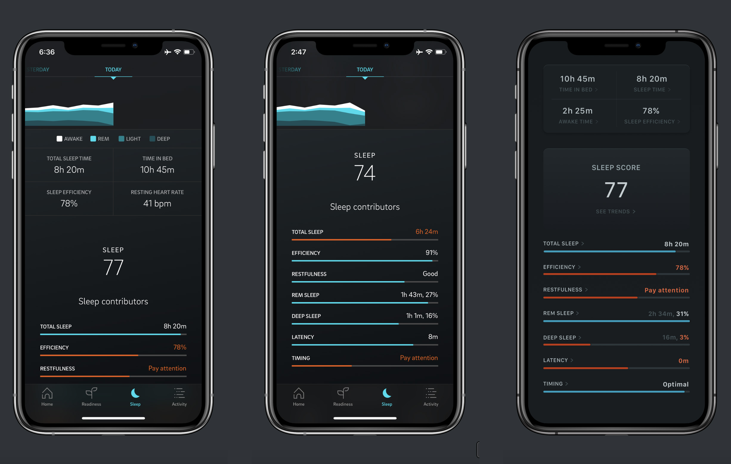
The issue is that the UX design of the Oura app has some quirks. Let’s take for example the Sleep section. There are many parts of the UI that are tappable. The problem is that the UI doesn’t communicate that well.
Designing UI and UX with Framer
I felt there was room for improvement. I fired up Framer X and fiddled with some ideas. By the way, Framer X turns out to be very good at “standard” UI and UX design without interactions.
I had three goals in improving the User Experience:
- Improve legibility
- Improve interactivity
- Improve information hierarchy
Obviously I am an outsider. I don’t have knowledge on Oura’s user research neither its business. I tried to be respectful to the existing design language. Lots of hard work went into designing the Oura app.
In retrospect, designing static pixels for UI and UX in Framer X has an advantage. It is easy to turn those static pixels into interactive pixels later on.
Improving Legibility
Fonts have increased letter spacing. Their size and weight are consistent and proportional in their respective sections. Font color is identical to the primary color of the app but uses a different luminance value. No grays, no whites only a single color
Improving Interactivity
All parts of the UI a user can interact with now have a chevron icon. The color is again based on the primary color of the app with a different luminance value.
Improving Information Hierarchy
While information density is identical, hierarchy derives from color. Important information is brighter while secondary information takes a step back.
To group information color was again the tool create sections. Subtle shadows blend the distinct area. The results fits very well with the current design language.
To blend information and create a sense of flow a gradient color did the trick. The Sleep Score, prominent in its nature, fades gracefully to reveal its inner parts.
Redesign Summary
It was a delightful experience to redesign a small part, the sleep stats of the Oura app. Not only that but Framer X design with static pixels was a lot of fun.
This design is accessible for people with color blindness such as deuteranopia, protanopia, tritanopia, grayscale.
Bonus
An older concept for improved UI and UX in the Settings section of the Oura ring app for iOS.
Many thanks to Siri for her feedback.