Ice Cream Plans and Pricing Landing Page, Built with Framer and No Code

Plans and pricing pages are boring by nature. At least for most websites. The goal is to convince a person to buy something. Naturally, the focus of the design is on optimizing these interactions. That’s fair and necessary. Paying customers is what a business needs. Loyal customers are what a smart company wants.
The secret flavor of micro interaction
One way to make these plans and pricing pages more interesting is to add micro interactions. It can be any kind of interaction. Animation, color, sound or haptics. Primary or secondary. It doesn’t matter. We strive to improve the user experience. It’s also an opportunity for designers to remind users of the character and tone of the product or brand.
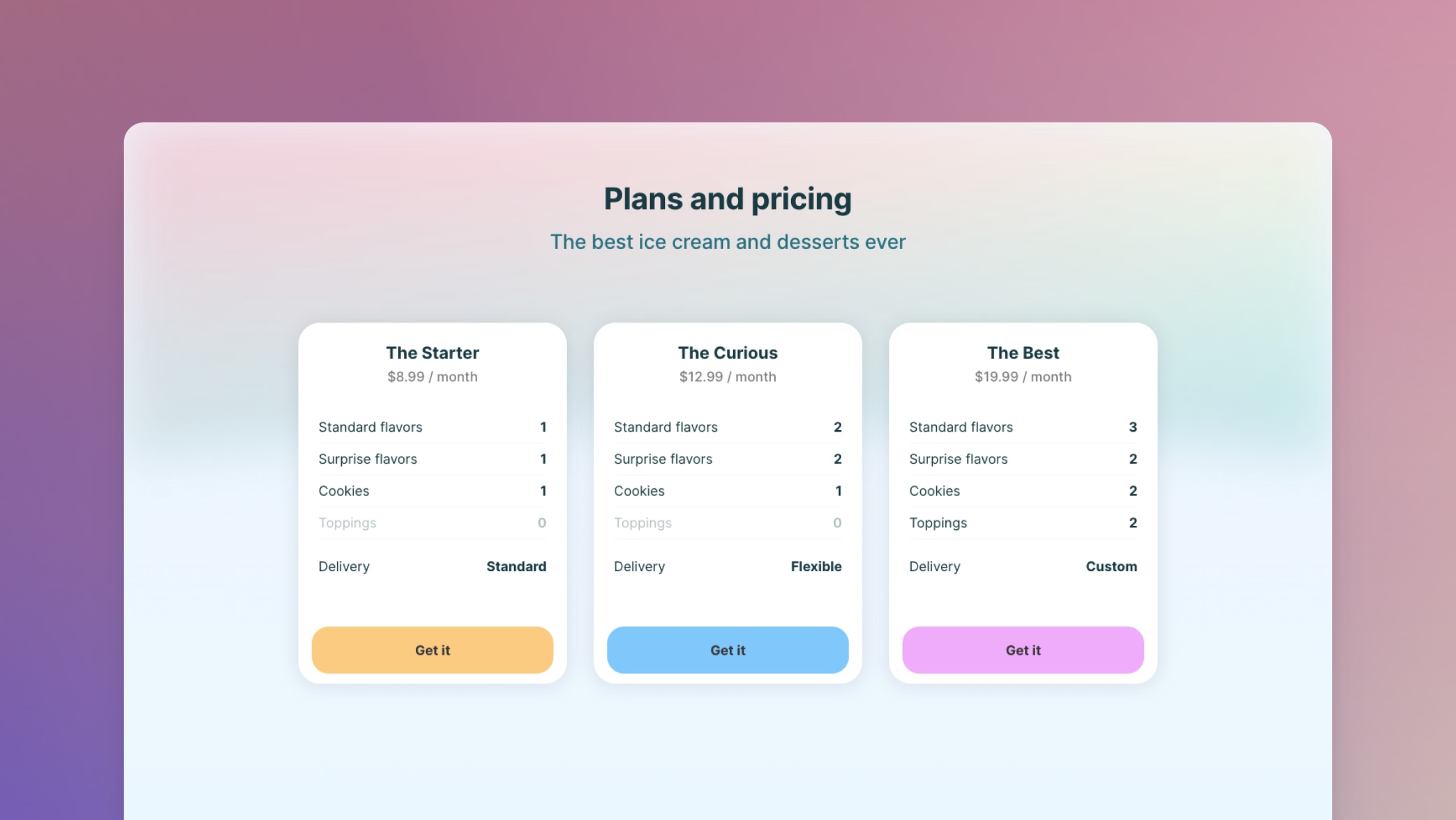
The Ice Cream landing page is vibrant and simple. The design uses the familiar cards paradigm over a beautiful gradient background to increase contrast. That’s what a person sees. The experience is something different. Here, things get a little more interesting.
The design of micro interaction
Every time the cursor moves over a card, something special happens. In this example, three things happen with varying visual weight.
- The buy button animates and a beautiful graphic appears. For each plan, the graphic element communicates a unique emotion. It also matches the color of the button.
- The shadow color of each plan animates ever so slightly. It again matches the color of the button.
- The color of the plan’s name changes too.
This micro interaction is playful and quirky. Surprising and captivative. The animation and graphics communicate something positive and cute for each plan. For every price. For all choices.
Check the prototype
You can experience the animations and micro interactions below. Just hover over each card.
Open the prototype on Framer Showcase to see the micro interaction on your beautiful, big screen. Duplicate on Framer to see how it was built.
